Foco Escola started as an educational diagnostics tool and evolved into a data analytics platform for educators. It offers evidence-based insights and a centralized view of standardized tests data so teachers can improve their practices and students’ learning.
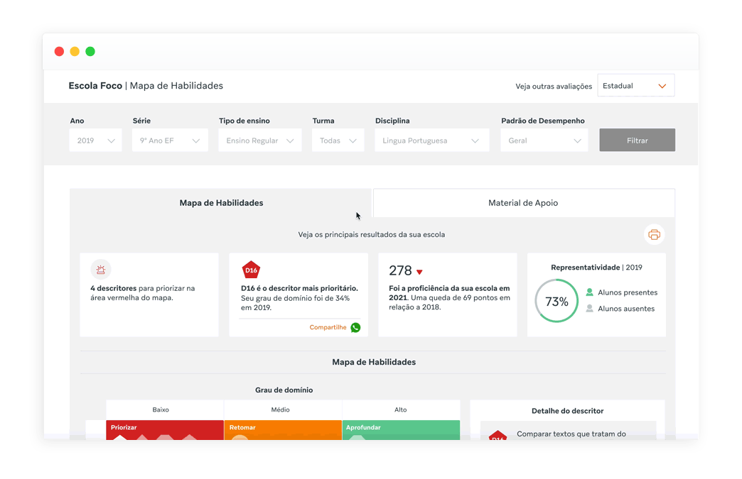
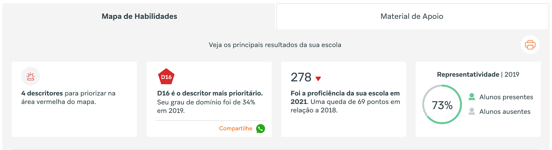
Its main innovation, the "abilities map," gives the teachers a prioritized view of all topics evaluated in each exam, discipline, and grade.
Problem understanding
(research and hypotheses)
(research and hypotheses)
Diagnostics alone are not enough. Teachers need guidance to translate data into actionable insights. Add to that, the accelerated digital transformation brought about by the global pandemic that increased the demand for online educational materials, presenting new opportunities and challenges in this evolving context.
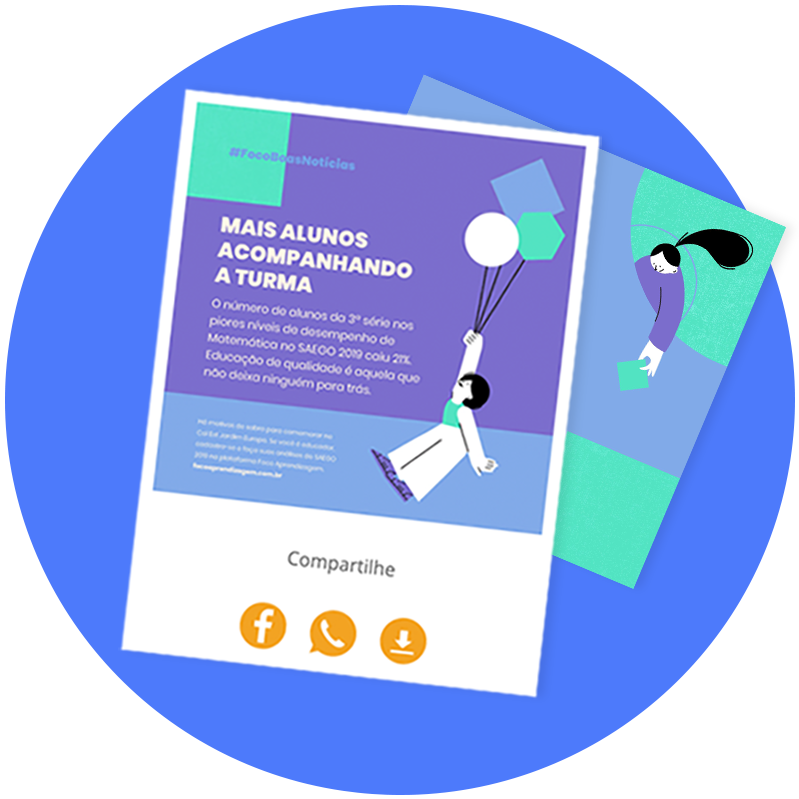
The relevance of didactic materials increased with remote learning, but the platform didn't offer it in an accessible way. So, how could we reduce this friction?
Firstly, I gathered all data from previous user interviews and analyzed some recorded interactions on Hotjar, a user journey-tracking tool. Many usability problems have already been mapped, together with the user's desire for more didactic materials.
According to the data, the user flow seemed to be the core problem. To access the materials, users had to take five steps:

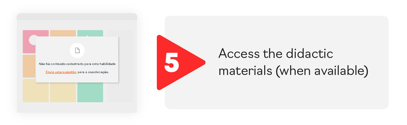

Besides being a long flow, it also created frustration because after all these steps, very often, there were no resulting materials related to the topic. So, the problems mapped were:
1. A very long flow to access valuable information;
1. A very long flow to access valuable information;
2. Valuable information is hidden;
3. A lack of materials for specific topics.
Envisioning the experience
(ideation and test)
(ideation and test)
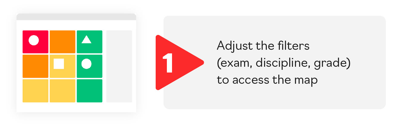
To tackle these problems, we decided to work on a new version of the page. We incorporate solutions previously designed and bring all valuable information to the first access level.
We designed a shorter flow with only two steps to shorten the user journey. It was a challenge due to the complexity of data and development limitations.
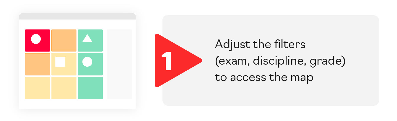
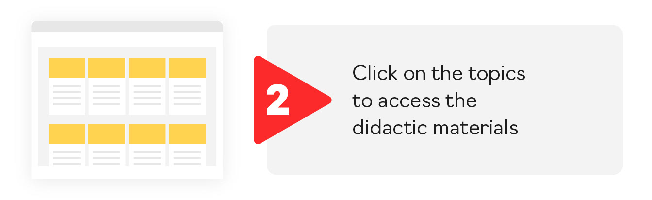
After some work, we proposed a simple click interaction in which all the information on the page change when the user clicks on a specific topic.
During the process, we tested the prototype with users and found that they liked the page but were confused with the new interaction. They didn't understand that the didactic materials cards changed with the click.
Back to the drawing board
(final version and results)
(final version and results)
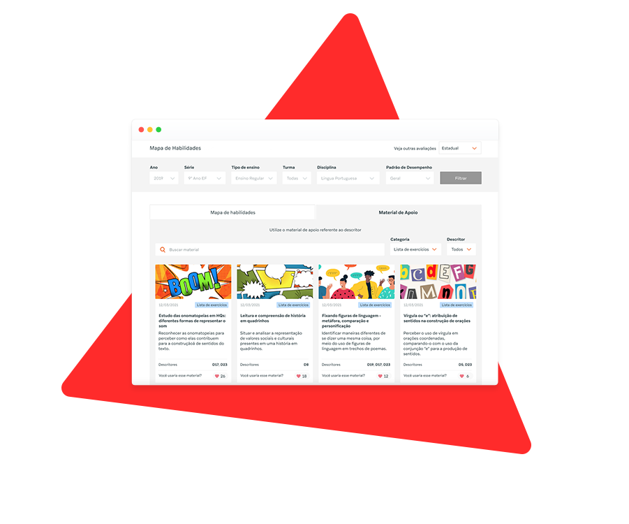
To overcome these misunderstandings, we designed another interaction: tab navigation. Now, users can access a dedicated page for didactic material, independent from the map, where all content is readily available.
In addition to solving the usability problem, it also solves the frustration of not having enough materials accessible.
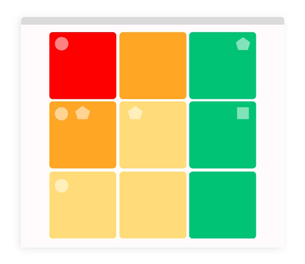
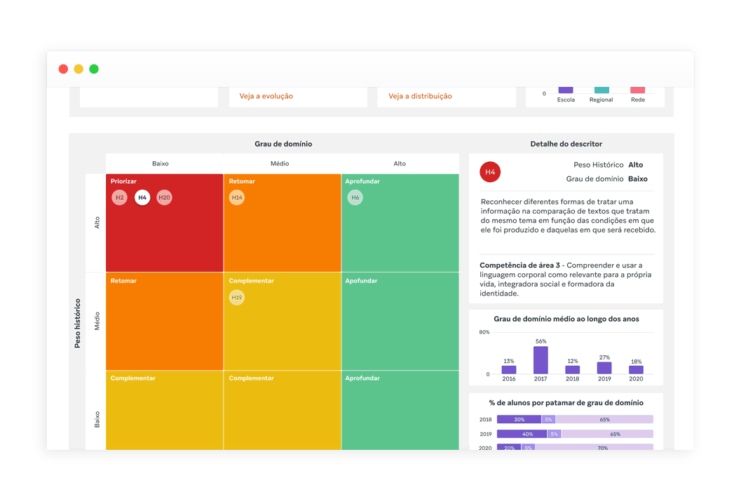
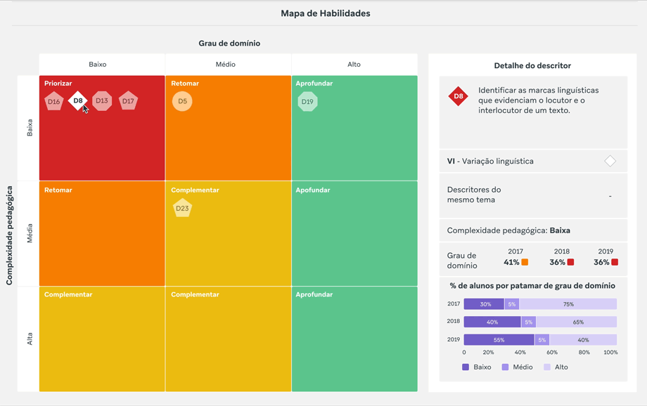
Map redesign
Map tab
We added insights to the page to give teachers a data overview. This way, they might choose to deepen the analysis or use higher-level insights for faster action.
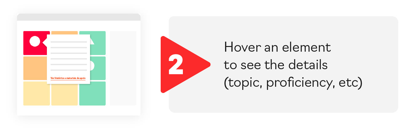
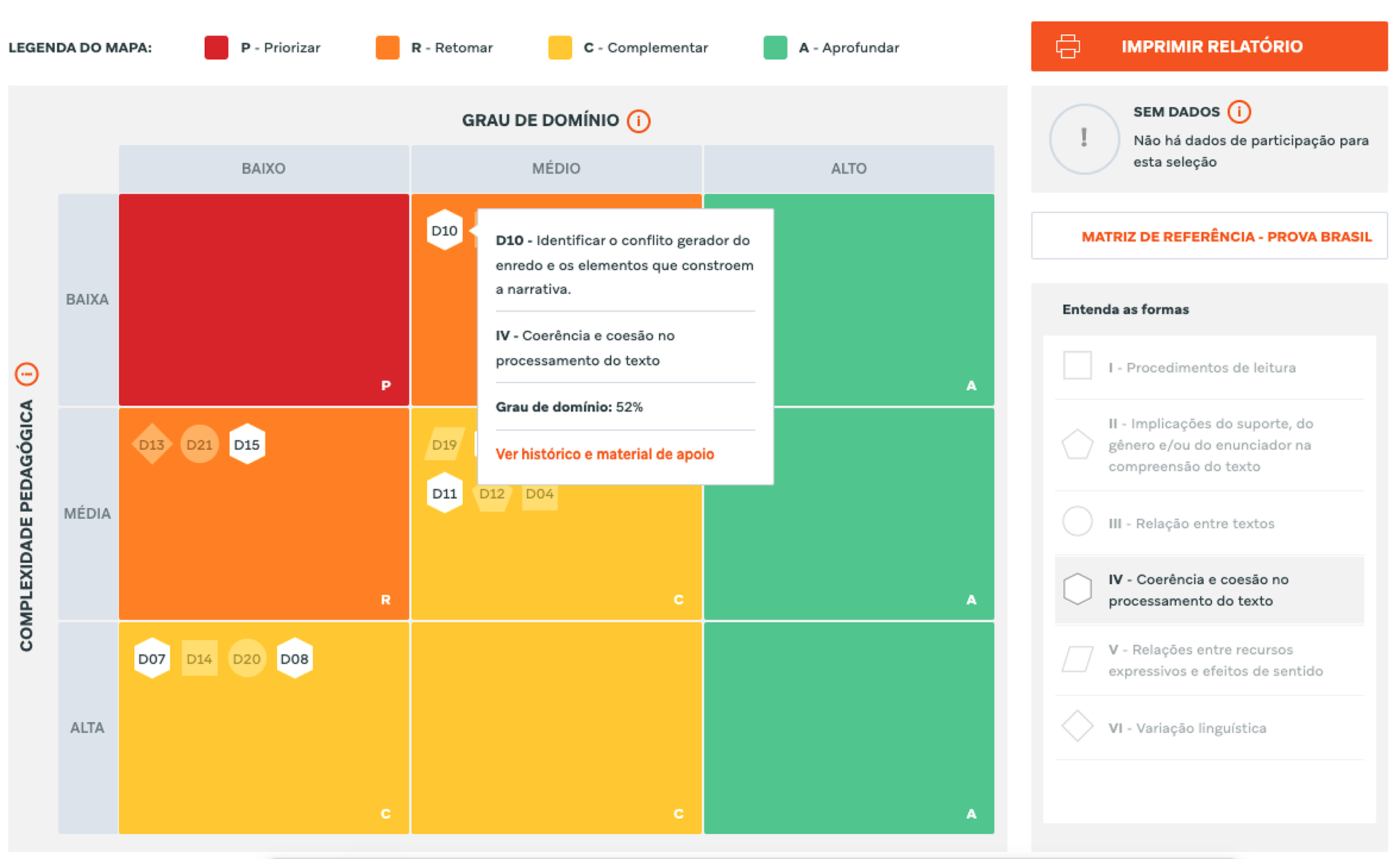
Map details
(before)
(before)
Users needed to open a modal screen and navigate further to access the details. The horizontal navigation made it difficult to analyze information by isolating it from the context.
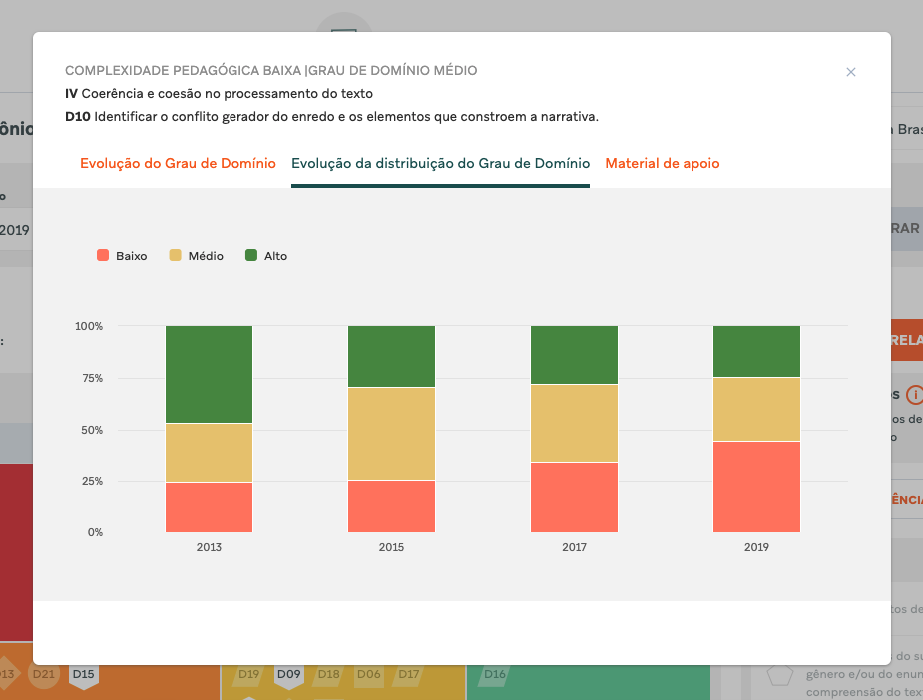
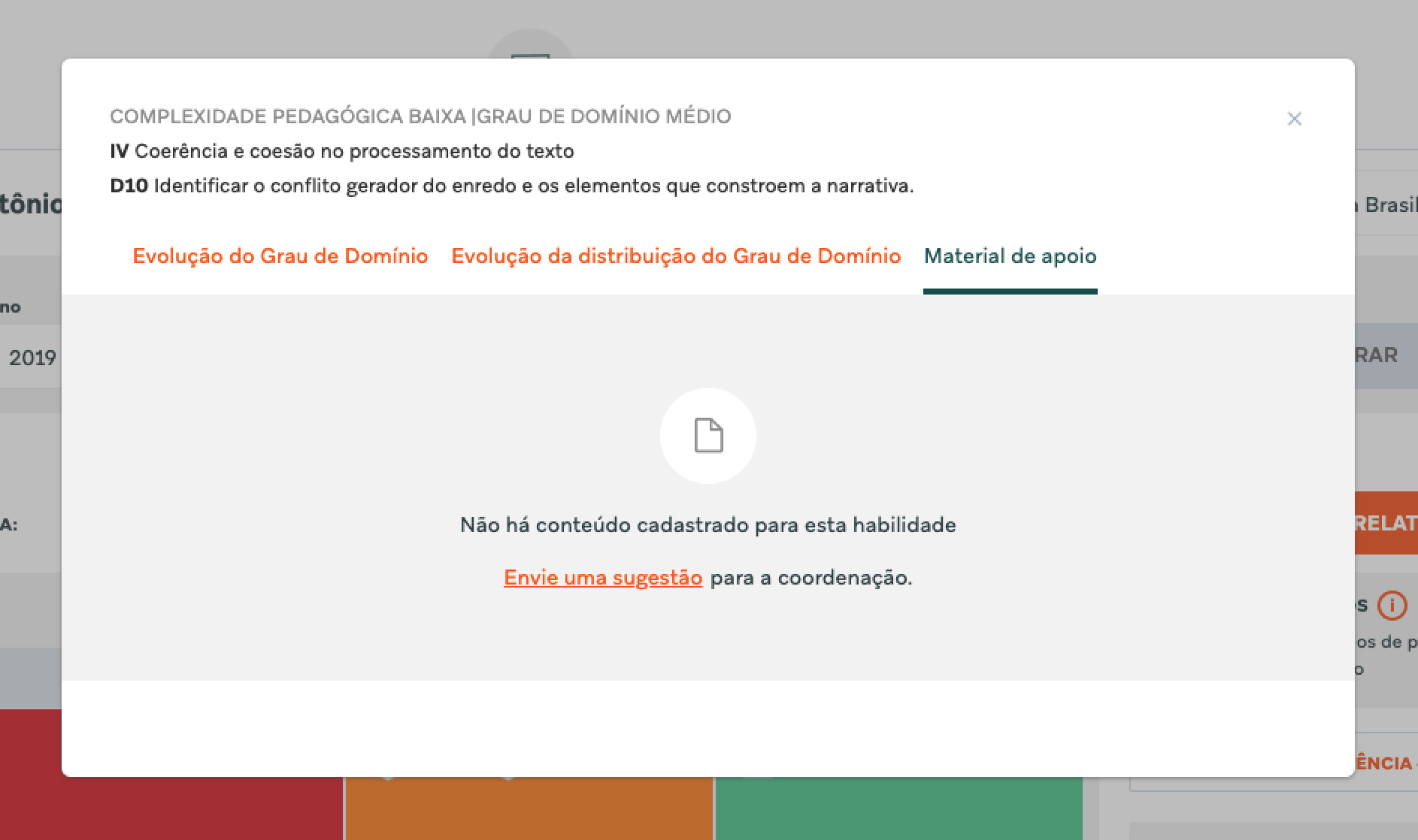
Map details
(after)
(after)
To improve the interaction, we brought information closer to the map to ease association. With a single click, the user can compare each topic with its details.
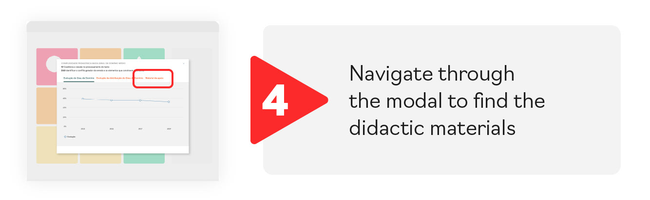
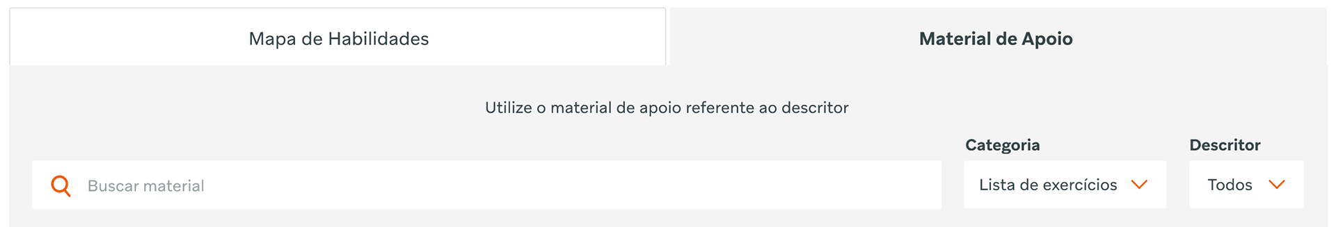
Didactic materials redesign
Didactic materials tab
The tab navigation allows teachers to access and filter didactic materials directly, independently from the map.
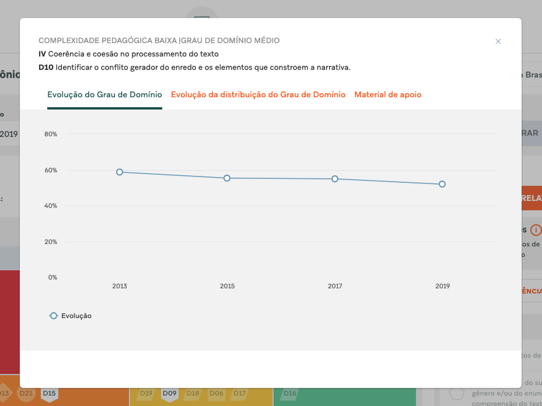
Didactic materials cards
(before)
(before)
Users needed to open a modal and navigate through it. After a lot of steps, very often, they didn't find any material related. When available, the content appeared as a link list.
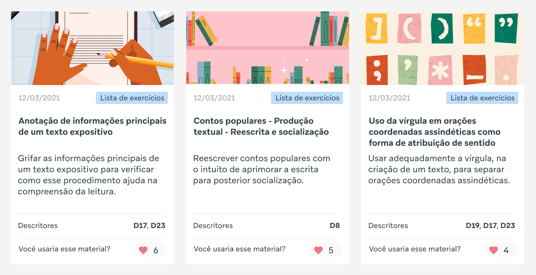
Didactic materials cards
(after)
(after)
On a dedicated page with informative cards, it is easier for teachers to find what they were looking for. This way, the frustration of not finding related materials after a long search is totally avoided. We also added buttons for teachers to give their likes and feedback, and share their practices with their peers.

My role