


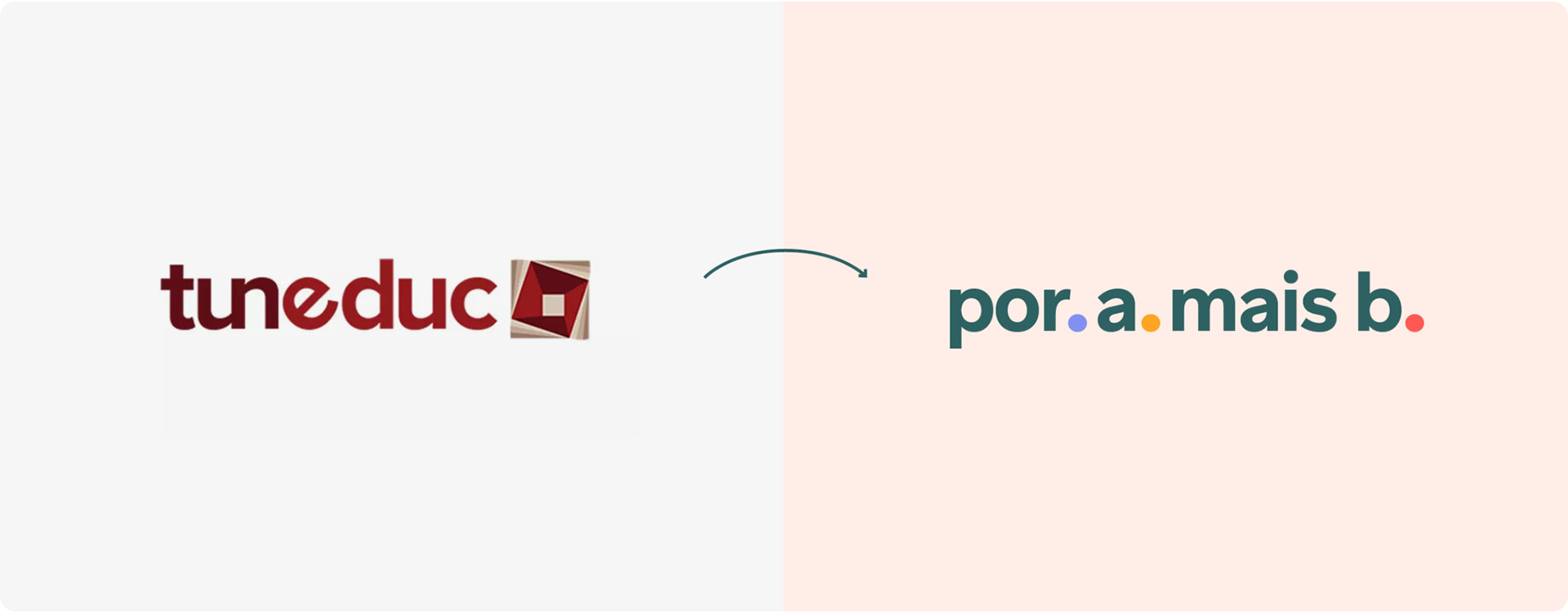
Tuneduc was born in 2013 with a mission: to make sense of educational data. In 2020, seven years after the company's birth, I led a rebranding project that changed its business strategy, name, and visual identity.
Our team worked together with Coletivo Oitentaedois, a design studio based in São Paulo. Besides all the design collaboration, my role was to coordinate all project phases: internal workshops, approvals, guidelines, and the in-house development of two new websites.

Por A Mais B
a new name for a new vision
a new name for a new vision
Coletivo Oitentaedois followed a research-led process that combined and translated the vision of the different teams, stakeholders, partners, and educators.
Based on the interviews and a series of internal reflections sparked by the process, we concluded that we needed a narrow product portfolio. So, the company's focus shifted to the main product, made for public schools.
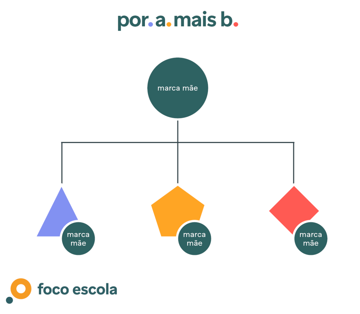
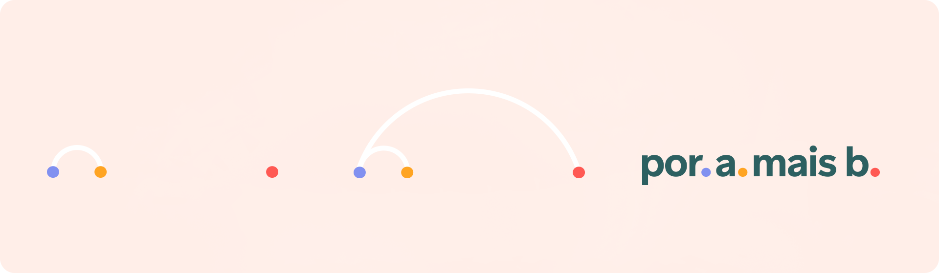
In Portuguese, the name "Por A Mais B" (or A+B) communicates the company's core values:
• That every educator has a role in using data effectively: being a policymaker, a teacher, a specialist, or a beginner (A or B)
• That a data culture is built by collaboration, by joining forces and working together (+)
• That this change happens step by step (the dots at the logo)
But to build change with data it is necessary to communicate complex concepts with simplicity. So, the new identity displays simple geometric shapes and an easy language. It also brings modularity to the system, enabling the development of new logos for future products.
From point to point, education takes shape.
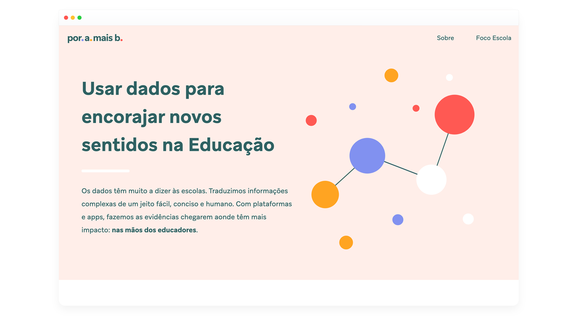
Simplicity and modularity concepts also inspired the website development. With a light design and playful animations, it translates data concepts simply and concisely.


Foco Escola
data intelligence for public schools
data intelligence for public schools
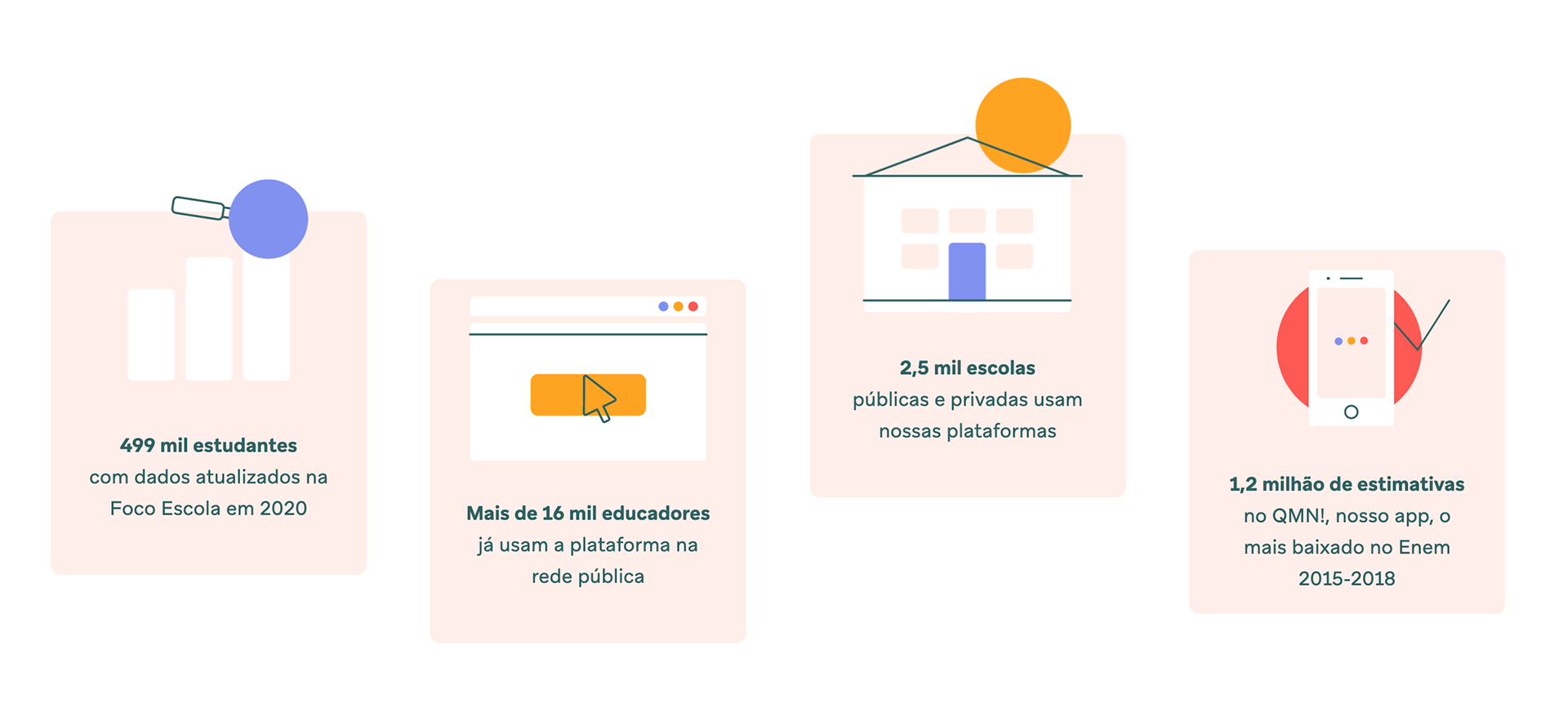
Foco Escola, the main product, previously called Foco Brasil, is a platform that brings data-driven insights to educators, educational managers, and policymakers to make better decisions and improve students' learning.
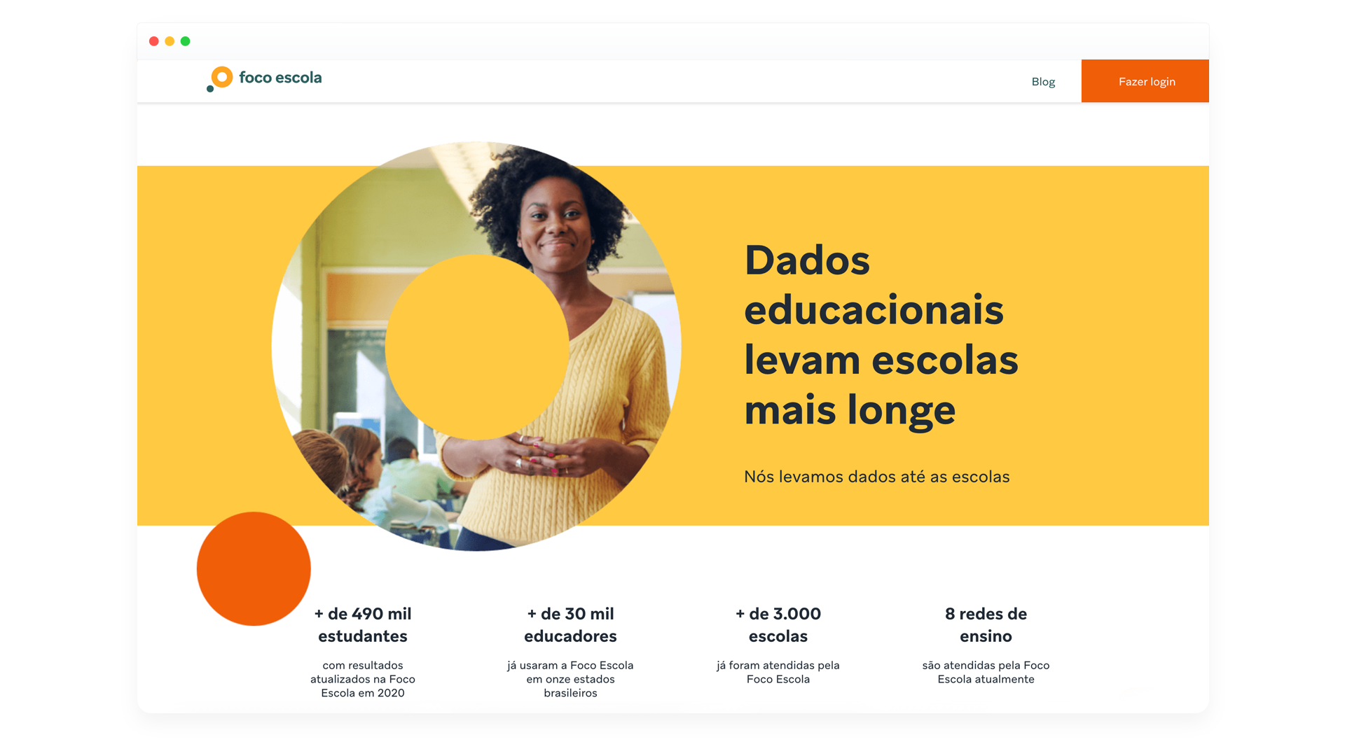
Foco rebranded to fit the company's new identity.
The new name, Foco Escola, highlights the word School (Escola) to talk more directly to the educators.
The new name, Foco Escola, highlights the word School (Escola) to talk more directly to the educators.
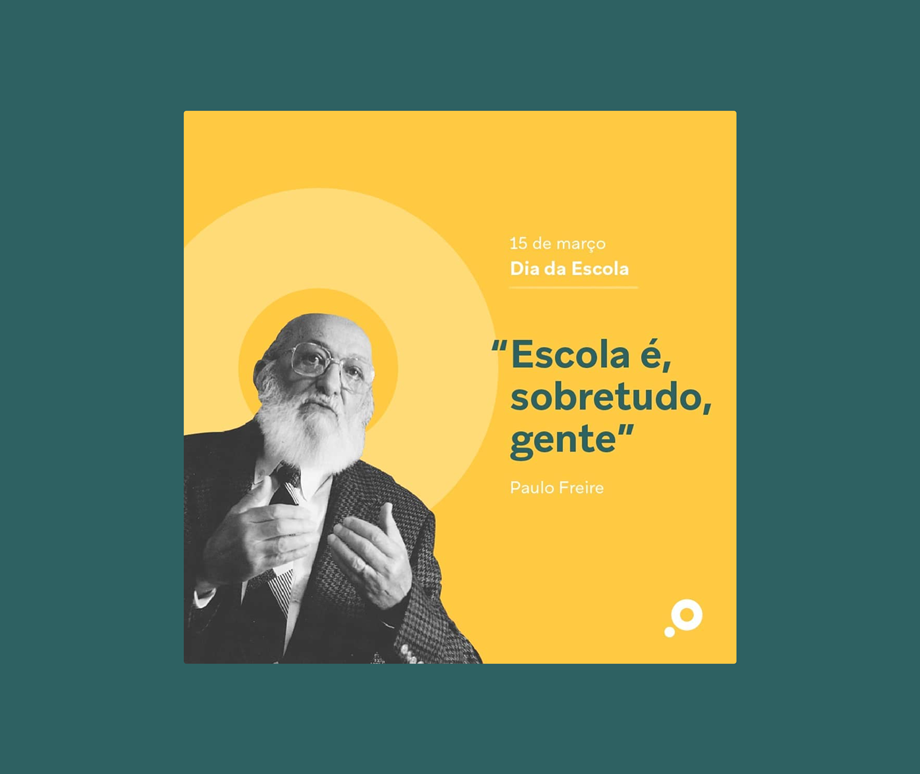
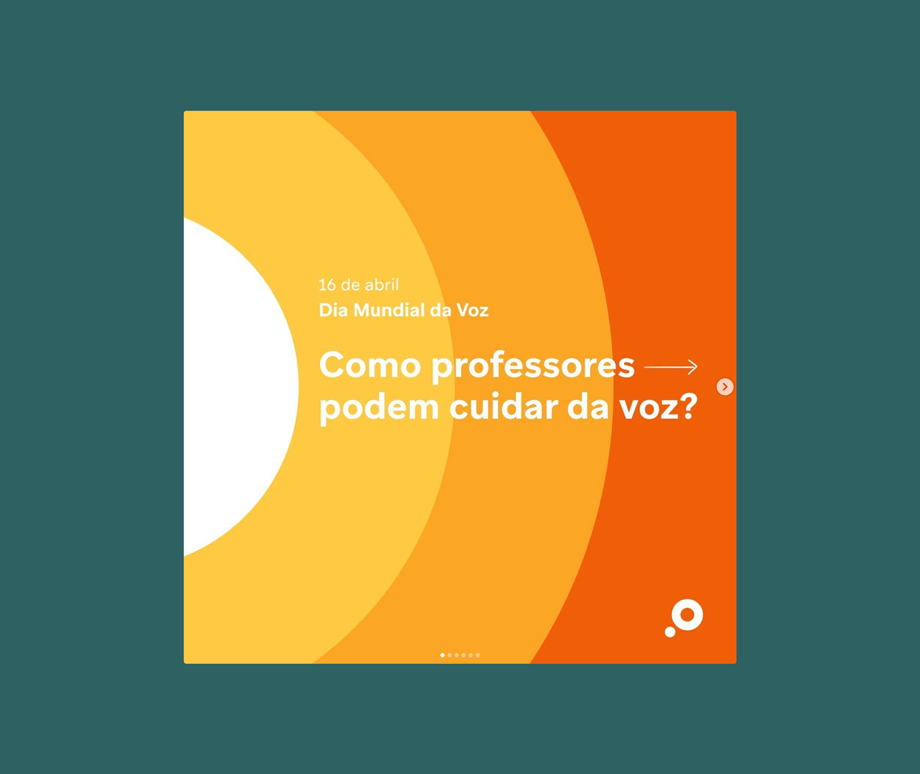
The vibrant color palette suggests a bold new vision and, combined with illustrations, composes a fun communication language closer to the teachers.


My role
Branding coordination
(+ Coletivo Oitentaedois)
(+ Coletivo Oitentaedois)
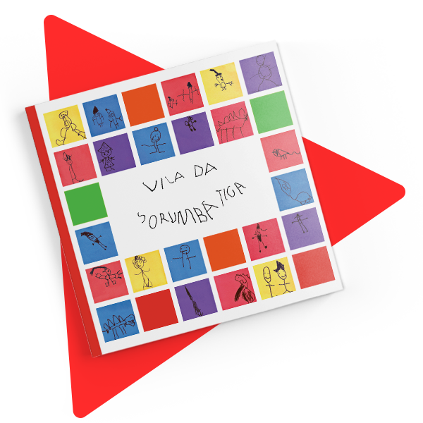
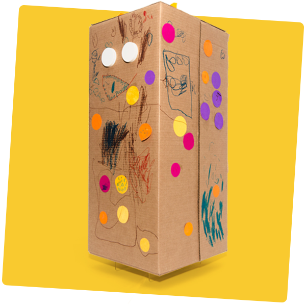
Illustrations and art direction
(+ Rodrigo Brazão e Giovanna Napoli)
(+ Rodrigo Brazão e Giovanna Napoli)
Sites (+ Thiago Vakka)